Call to Action (CTA): How to Write + 17 Effective Examples

If your marketing campaign isn’t converting, your Call to Action (CTA) might be the silent culprit. In one study, Baymard Institute found that 70.19% of shoppers abandon their carts simply because delivery details weren’t clearly communicated. It’s a reminder that even small elements can quietly sink conversions.
We’ve seen this play out across dozens of projects: landing pages, SaaS onboarding flows, and e-commerce PDPs. CTAs are rarely the flashiest element on the page, but they’re one of the most consequential.
In this guide, you’ll learn how to write high-converting CTAs based on what we’ve seen work in real tests. You’ll also explore 17 examples that reflect the patterns behind consistent conversion lifts.
What is a Call to Action in Marketing?
A Call to Action (CTA) is a text or button that promotes a desired action from a consumer, typically by creating a sense of urgency. It serves as a direct prompt for the consumer to undertake a specific, simple, and evident action, which can be anything from downloading a lead magnet, submitting an enquiry, or making a purchase.
Calls to action are integral to digital marketing because they directly drive sales and conversions. Without a clear call to action, visitors may be uncertain about the next steps, leading to missed opportunities and inefficient marketing investments.
Furthermore, CTAs guide the customer journey, advancing consumers through various stages of the buying process. Their performance is often evaluated through A/B testing in marketing, where even small tweaks can lead to measurable gains.
Effective Call to Action Examples
In our work with marketing teams and CRO-focused brands, effective calls to action are rarely complex. They tend to be direct, benefit-driven, and contextually relevant. Here are some examples.
- Direct Action: Direct action CTAs like "Buy Now," "Sign up," or "Subscribe" are clear and instructive.
- Information Seeking: Information-seeking CTAs such as "Learn more" allows users to get additional details without immediate commitment.
- Product/Service Trial: Product or service trial CTAs like "Try Paper" or "Try Prime Membership" encourage users to experience something firsthand.
- Shopping: Shopping-related CTAs such as "Shop Now," "Add Selected Products to Cart," or "Add to Basket" facilitate transactions.
- Benefit-Oriented Phrases: Integrating benefits like "make a difference today," "free delivery," "pick up today," or "compare products side-by-side" can be very alluring.
- Specific Offers: Specific offers, including "$1000 off" or buttons labeled "See Deals," use concrete value to drive urgency.
- Local/Geographic: Local or geographic CTAs use real-world context to guide nearby users, such as "Find a Store Near You" or "Visit Our Location Today” to drive foot traffic.
Key Characteristics of Effective CTAs
An effective call-to-action is characterized by several key elements that ensure its visibility, appeal, and motivational power. We’ve seen these traits come up again and again in our testing, whether we’re working on SaaS dashboards, onboarding flows, or e-commerce product cards.
1. Clarity and Prominence
A call to action must be clear, distinct, and easily identifiable on a page. It should tell the user exactly what to do using direct and simple language. For example, action verbs like "Sign up," "Buy now," or "Subscribe" work better than generic terms like "Submit," which can reduce conversions. In fact, it is often better to be too obvious than too vague.
Adding a quick tagline within or near the CTA can reinforce the intended action and make it stand out more effectively. For example, a subtext like “No credit card required” or “Takes less than 60 seconds” can enhance clarity.
Effective calls to action also emphasize benefits. Instead of listing product features, focus on what the user gains from clicking. A good example might be highlighting "free delivery" or "instant access" to make the CTA more appealing.
2. Strategic Placement
As a crucial element on a page, the CTA must be visible enough to draw users' attention. Its message should be conspicuous so that even scanning readers can quickly grasp the offer.
The most effective placements are typically both above the fold, where the CTA is visible without scrolling, and at the end of the content. This ensures users encounter the CTA regardless of where they are in the reading journey.
For longer pages or emails, it may be necessary to include multiple calls to action. These should appear roughly every "screen", which is about every 400 to 500 lines of vertical resolution. You should also place a CTA at the conclusion of each significant content section to maintain engagement.
To stand out, each CTA should occupy its own distinct space and should not be positioned too close to other major elements like headlines or main images. Doing so can diminish their visibility and reduce the effectiveness of other page components.
Some websites can benefit from persistent call-to-actions (PCTA), which are consistent call-to-action areas embedded within a website's template, such as those for quote requests or newsletter sign-ups. They are especially powerful in prompting nearly convinced prospects to take action and have been shown to significantly increase conversions.
In some cases, though, the most effective CTA isn’t just the button. Rather, it’s what surrounds it. When we helped run a test for Tile Giant, a UK tile retailer, we experimented with different product card designs on their search results page.
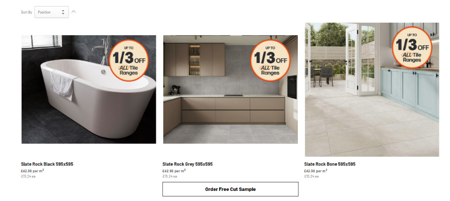
We tested three design variants against the original. The control version looked like this:

It had just one CTA: “Order Free Cut Sample.” There were no swatches, no delivery information, and no second button to view the full product.
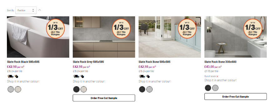
Here’s Variant 1:

We added delivery info like “Delivered in 2–4 days” and included swatches. But we didn’t add a new CTA, just improved the content around the existing one.
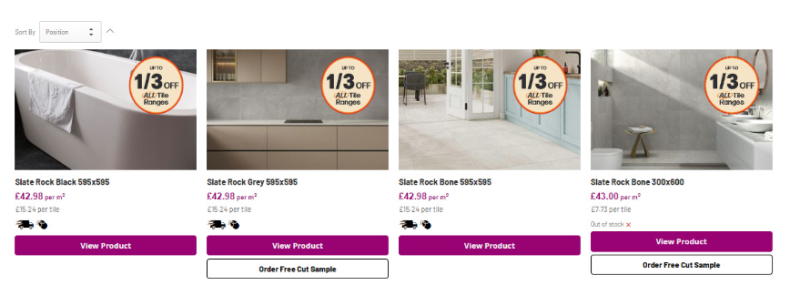
Variant 2 took a different approach:

This version added a bold “View Product” button along with delivery info. But it dropped the swatches.
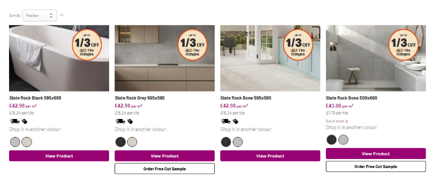
Variant 3 combined it all:

Delivery info, swatches, a bold “View Product” CTA, and the original sample button were all included.
The results were clear. Variant 1 performed the best:
- 13 percent more product views
- 50 percent increase in conversion rate
- 25 percent increase in revenue per visitor
What worked wasn’t a louder CTA. It was the supporting context. Adding delivery clarity and simple visual cues made users more confident, which translated into better results without needing a more aggressive design.
3. Compelling Design
A well-designed CTA not only attracts attention but also makes it clear what action to take. Strong visual hierarchy, contrast, and alignment with your brand can significantly improve performance.
- Button Preference: Buttons are the most commonly used and effective type of CTA.
- Size: Larger buttons can enhance visibility, particularly on pages that haven't been optimized for conversion.
- Color and Contrast: Color strongly influences user perception, and as such call-to-action buttons should use standout colors that align with brand identity, the target audience’s preferences, and cultural norms.
- Visual Elements: Icons, shapes, and images used with CTAs should resonate with consumers and facilitate quick, convenient actions. However, these visuals must not distract from the primary message.
4. Relevance and Continuity
CTAs work best when they align with user expectations and flow naturally within the broader page experience. Relevance, consistency, and timing all influence how likely someone is to take action.
- “Scent Trail” Continuity: The CTA and its landing page must maintain message consistency with the ad or link that brought the visitor there. A disconnect can disorient users and cause them to bounce.
- Congruency: All elements on the page, including the CTA, should support the same value proposition and primary conversion goal.
- Visitor Mindset: CTAs should reflect the visitor's intent and awareness level. For example, users from search engines are often more solution-aware than those from paid ads, and may require a different tone or level of persuasion.
- Digital Buyer Personas: Crafting CTAs based on detailed buyer personas allows you to address specific motivations, needs, and objections tied to different audience segments.
5. Urgency and Incentives
Creating a sense of urgency is one of the most effective ways to drive immediate action. Although a visitor’s internal urgency (inherent need) is outside a marketer’s control, external urgency can be introduced through limited-time offers, seasonal prompts, or persuasive wording.
At the same time, strong incentives can help overcome hesitation. Offers like discounts, free trials, or bundles provide added value and lower perceived risk. Strong incentives can also emerge from experimentation with pricing strategies, where positioning a discount or bundle affects perceived value.
6. Continuous Testing and Optimization
Effective CTA performance relies on continuous testing. To avoid common mistakes in A/B testing, structured experiments should be prioritized over guesswork and surface-level changes.
Rather than treating CTA design as a one-time task, marketers should also adopt an iterative approach, regularly testing variations in wording, layout, and placement to discover what works best for their audience. Even major platforms like Microsoft report that only 10–20% of experiments yield significant positive results, reinforcing the need for rigorous experimentation frameworks.
Furthermore, every decision should be guided by data and analytics, not assumptions or generic best practices. Relying solely on before-and-after comparisons or isolated usability feedback, without proper testing controls, can lead to misleading conclusions.
Common Pitfalls to Avoid When Writing a CTA
Even well-designed calls to action can fall short if they are placed or written poorly. Below are common mistakes marketers should avoid when crafting calls to action.
Too Many Competing CTAs
Including multiple calls to action with different objectives on the same page can overwhelm visitors and split their attention. This often leads to decision fatigue, lower engagement, or complete inaction. It is usually more effective to focus on one primary conversion goal per page and support it with secondary actions only when strategically justified.
Hidden or Difficult-to-Locate Calls to Action
If a call-to-action is located below the fold, surrounded by dense content, or styled in a way that makes it blend into the background, users may not see it at all. Visibility is essential. Calls to action should be placed where users naturally look, such as above the fold or at key decision points, and should contrast clearly with other page elements.
Generic Wording
Words like "Submit" or "Click Here" are vague and provide no value to the user. These generic phrases lack direction and fail to communicate what will happen after the click. CTA copy should be specific, action-driven, and aligned with user intent, such as “Download the Free Guide” or “Start Your 7-Day Trial.”
Mismatch Between Ad and Landing Page
When users click on an ad expecting one thing and land on a page offering something different, it creates confusion and erodes trust. This misalignment, often called a "scent trail" break, can significantly increase bounce rates. The landing page should mirror the tone, language, and offer of the ad or link that led to it.
Assuming Immediate Motivation
Not all users are ready to convert right away. Some may be in the awareness or consideration stage and need more context before committing. Assuming everyone is ready to act can lead to overly aggressive CTAs. Instead, marketers should match the offer to the visitor’s stage in the funnel—providing educational resources, comparisons, or low-commitment actions where appropriate.
Supercharge Your Marketing with More Compelling CTAs
Whether you're crafting a landing page, designing a CTA button, or refining your email marketing sequence, one thing remains true: every piece of content you create should guide your target audience toward a specific action. The difference between good and great CTA copy often comes down to clarity, placement, and how well it fits within your overall marketing strategy.
But knowing what works and why requires more than intuition — it requires testing.
Mida.so is a no-code A/B testing platform for marketers, CRO teams, and founders who want to optimize CTA buttons, headlines, and layouts without writing code. Its lightweight script (~20 KB) loads changes in under 20 ms, with visual and code editors, AI-powered copy suggestions, and seamless GA4 integration. Mida works across Webflow, Shopify, WordPress, and other major platforms, including support for cross-domain personalization and feature flags.
Try Mida.so today and turn your marketing materials into data-driven conversion machines.


.svg)
