
Boost, a Barcelona-based, AI-first CRO agency with a global presence across three continents, partnered with Catalonia Hotels & Resorts to reduce friction at the single most sensitive step of the booking funnel: the payment details screen at checkout.
At the payment step of checkout, Catalonia Hotels presented its two payment options, "Pay at hotel" and "Pay now", as a plain, undifferentiated radio-button list with no supporting icons. Nothing visually distinguished one option from the other; both looked and read the same until a user stopped to parse the copy. That forced every visitor to read each word carefully to understand what they were actually choosing, slowing down the decision at the exact moment they were about to enter payment details, one of the highest-stakes, highest-drop-off points in the entire booking journey.
Boost's hypothesis was simple: a binary decision this important shouldn't require reading. It should be recognizable at a glance. Using Mida, Boost redesigned the "Payment details" block in checkout, on both desktop and mobile, and tested it against the original.
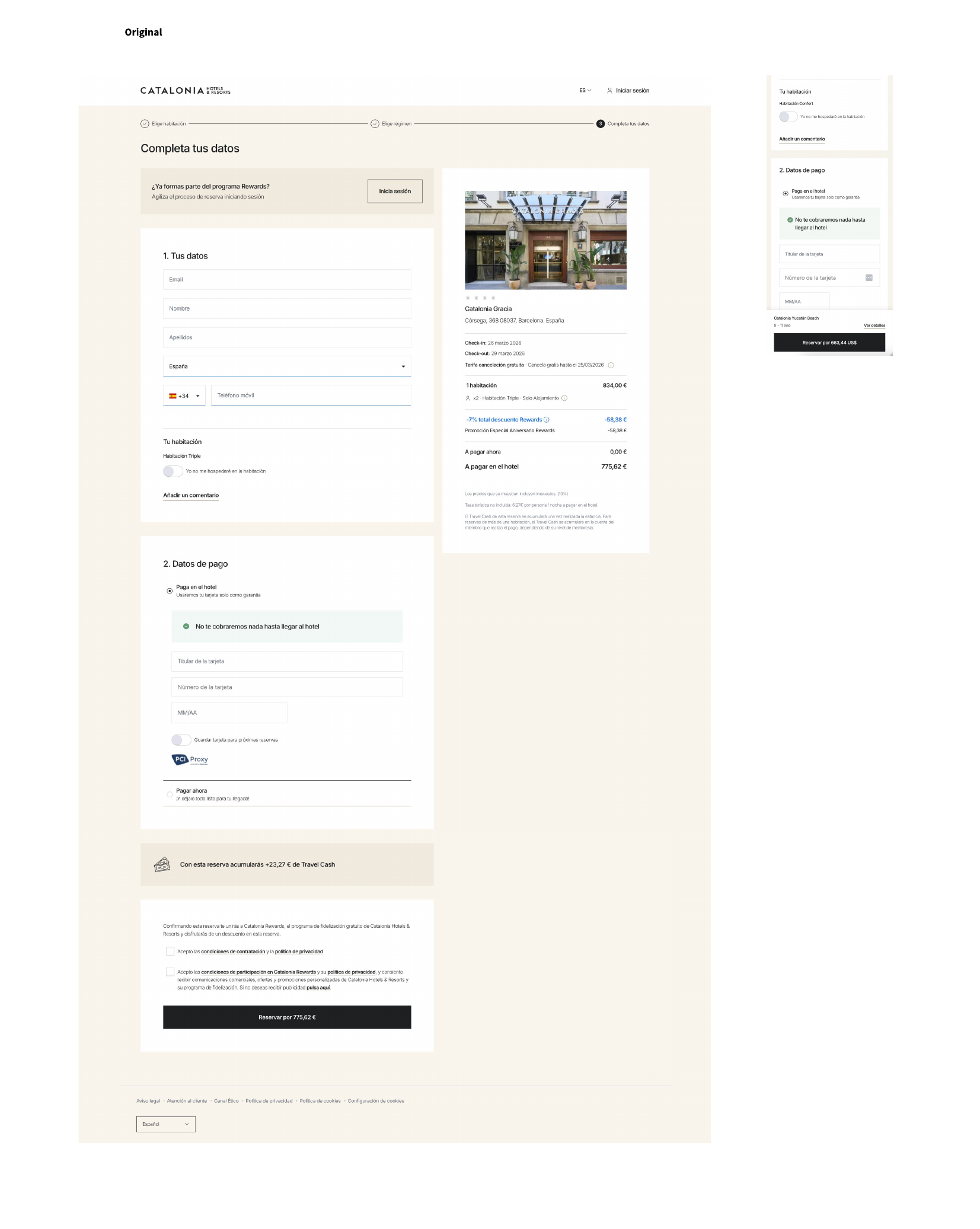
Before: at "2. Datos de pago," a plain radio-button list, two lines of text, no icons, no visual hierarchy between "Pay at hotel" and "Pay now."
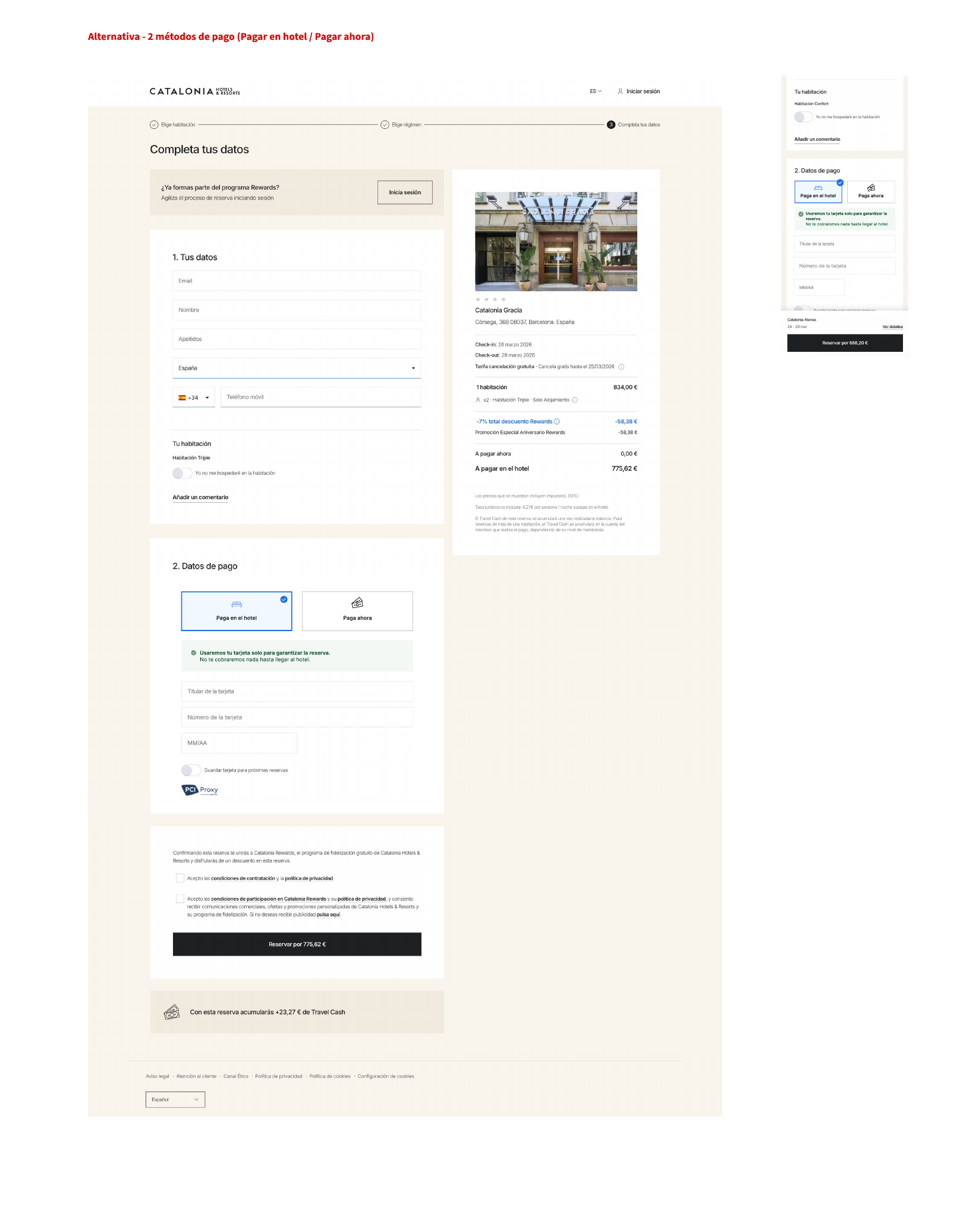
After: visual, selectable cards, each with dedicated iconography for its payment option, so the choice can be recognized rather than read.
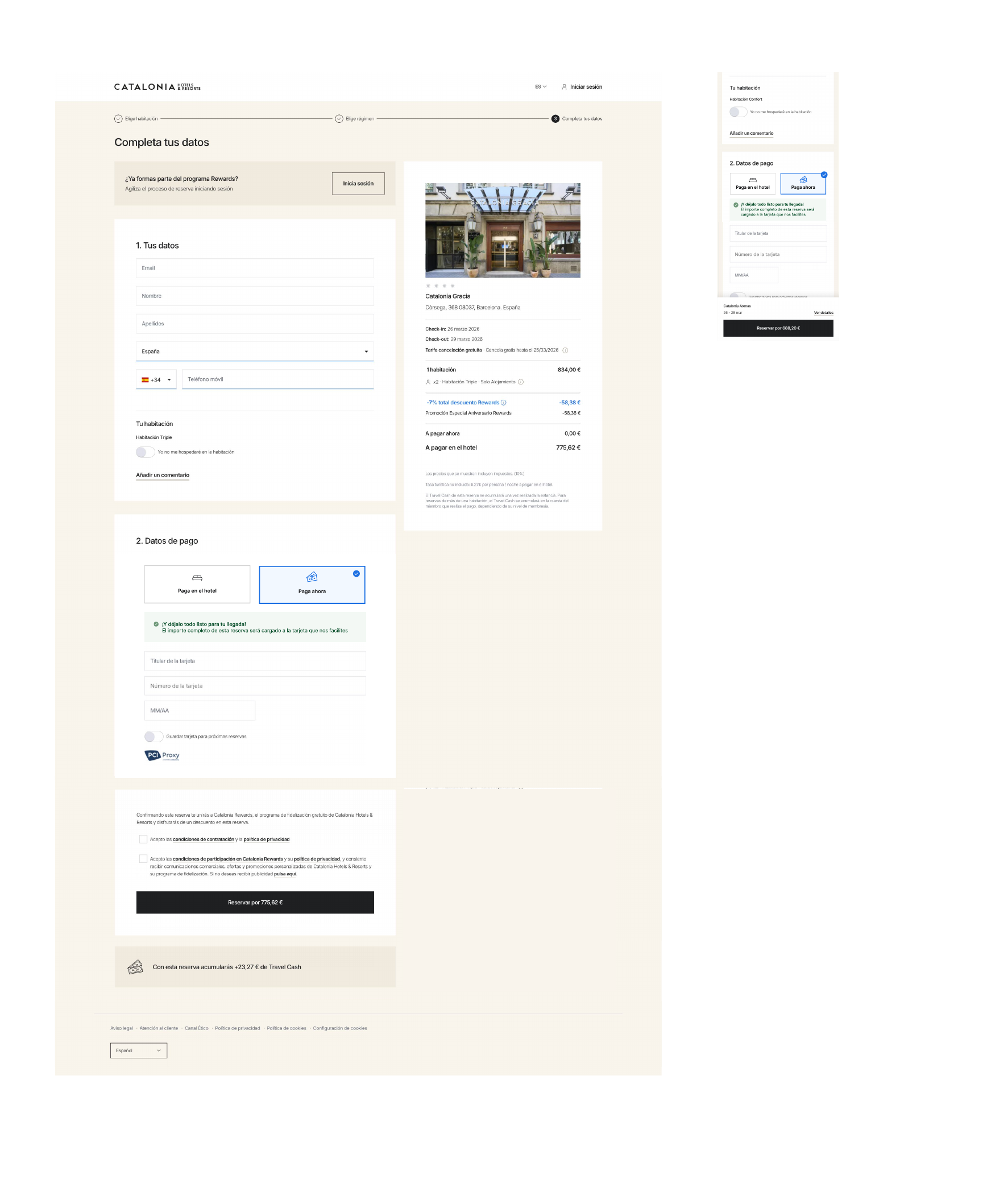
After, "Pay now" selected: the card state reinforcing when the card will actually be charged.
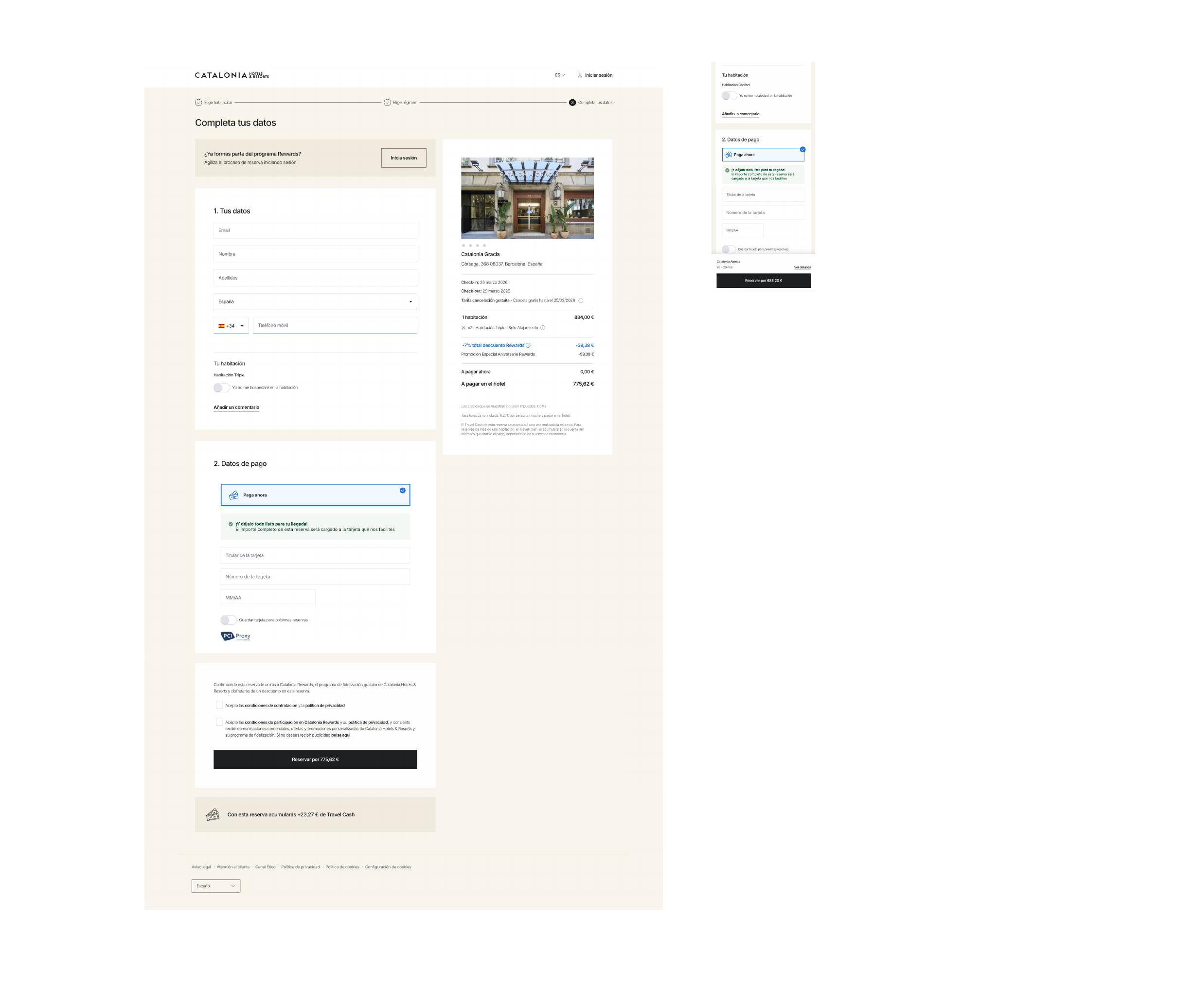
Another view of the "Pay now" selected state, showing the reinforced trust messaging alongside the card fields.
Checkout is not where users want to slow down and study copy. By giving each option its own card and icon, the redesign let visitors identify the option they wanted at a glance, cutting the cognitive load right before the highest-friction step of the funnel: entering payment details.
Before: No explanation of why a card was required, or reassurance about when it would actually be charged.
After: A reinforced trust message around the "no charge until arrival" guarantee, explaining the reasoning behind the card requirement.
Asking for a card number naturally raises a moment of doubt, even when the booking won't be charged immediately. By pairing the visual redesign with a clearer explanation of the guarantee, Boost addressed that hesitation directly instead of leaving it to the fine print.
Boost used Mida to split traffic between the original checkout and the redesigned "Payment details" block, measuring impact on Booking Confirmation across both the ES and EN versions of the site, and across desktop and mobile.
The redesigned variant won, with a 95.75% probability to beat control, delivering a +4.28% uplift in aggregate checkout conversion, from 34.53% to 36.01%. Results were cross-validated against GA4 analytics, which confirmed a comparable projected lift.
Across the site's roughly 34,000 monthly checkout visitors on the ES/EN versions, the winning variant is estimated to generate approximately +520 incremental bookings per month.
The most interesting layer of this test comes from splitting the results by device. The aggregate lift was positive across both desktop and mobile, but the effect was not uniform. On mobile, the improvement was stronger and reached statistical significance: +8.62%, from 26.05% to 28.30%, with a 97.86% probability to beat control. On desktop, the result stayed directionally positive but did not reach the same level of confidence.
That gap points to where the redesign's mechanism matters most. Limited screen space and faster, more fragmented reading on mobile make visual clarity disproportionately valuable there. The card-based redesign didn't just look better everywhere, it specifically reduced the reading burden at the moment users needed it least: on a small screen, right before entering payment details. (See the mobile mockups in the before/after screenshots above.)
Presenting binary decisions as scannable visual cards with icons, rather than text-only options, reduces cognitive load at high-stakes moments and reinforces user confidence when entering payment information.
Check the device split before calling a result done. An aggregate lift can hide a very different story underneath: here, mobile carried the statistically significant result, while desktop stayed only directionally positive, a distinction that changes how confidently the redesign should be rolled out and where to look next.
If you're looking to optimize your website's performance and streamline your A/B testing process, Mida is the ideal solution.
With its lightweight script and focus on performance, Mida ensures that your website remains fast and responsive while offering powerful A/B testing capabilities. Experience the benefits of Mida by integrating our lightweight script into your website today.
---
Get started for free on Mida — up to 100,000 monthly tested users.
Mida is 10X faster than anything you have ever considered. Try it yourself.

Mida.so is a super lightweight A/B testing tool to help you experiment, analyze and implement conversion strategies in minutes.


Still deciding?
A quick screen share on your actual site — no slides, no generic tour. Just your questions answered.
30 min · no commitment · no sales pressure