
Joseph Joseph is a London-based design brand known for innovative, space-saving kitchen and homeware products, sold through retailers worldwide and its own online store.
Joseph Joseph works with UK eCommerce CRO agency Proof3, who use Mida to run experiments across the site.
Joseph Joseph's site used a permanently sticky header. It kept search and navigation within reach at all times, but it also took up screen space throughout the shopping experience, pushing product imagery and content further down the page.
The challenge was to give products more visibility while keeping navigation easy to reach whenever shoppers needed it.
Instead of testing a single alternative, Proof3 used Mida's A/B/n testing to compare the existing header with two different approaches at the same time, all on the same URLs:
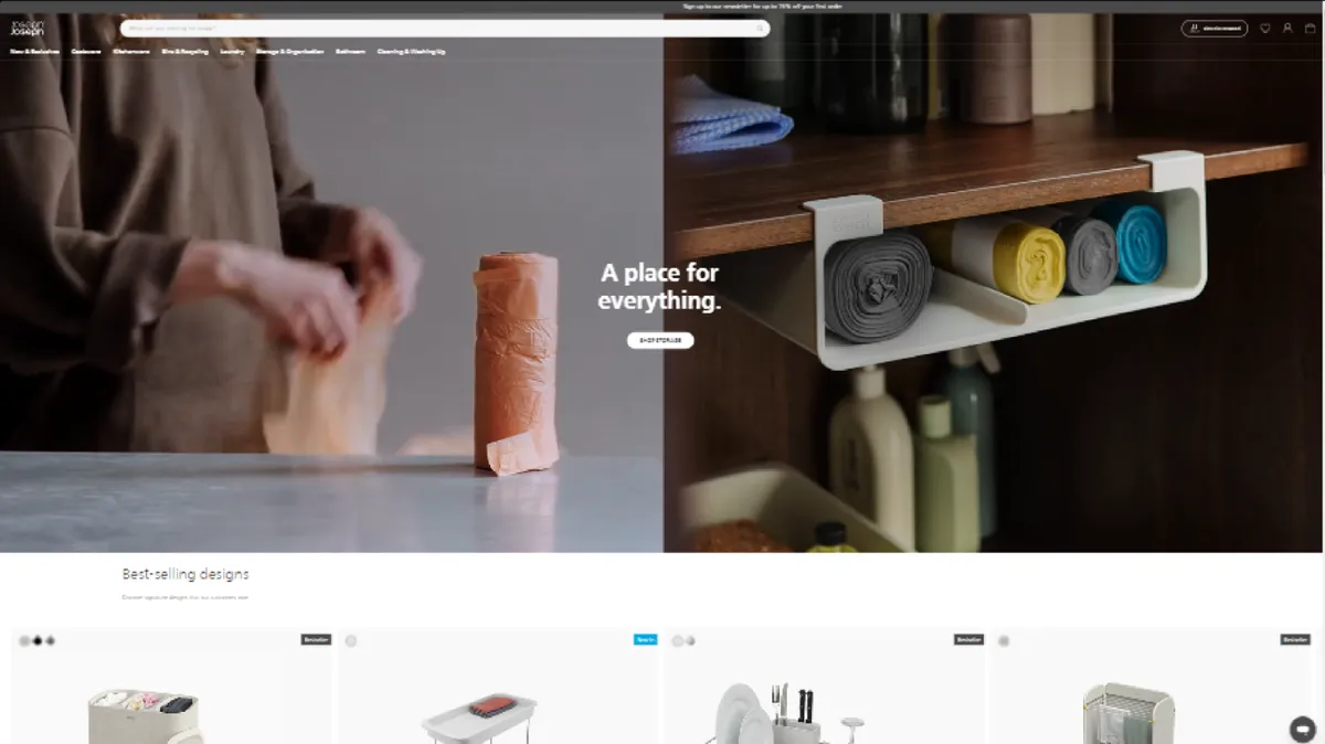
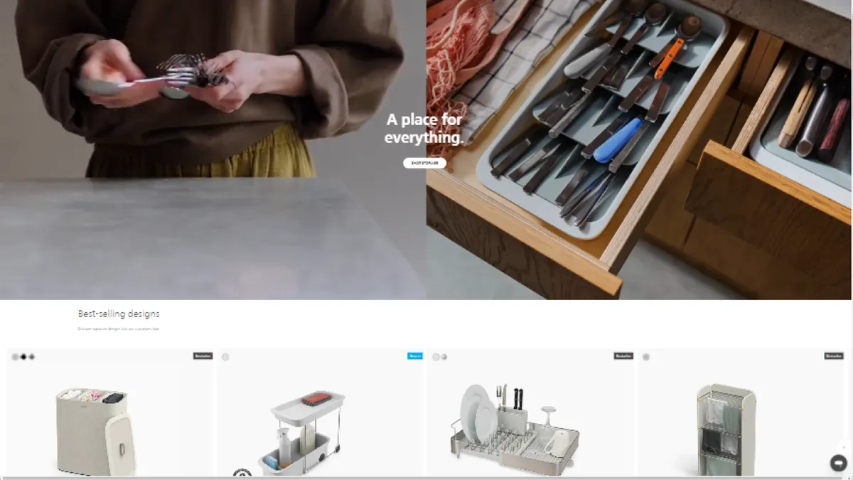
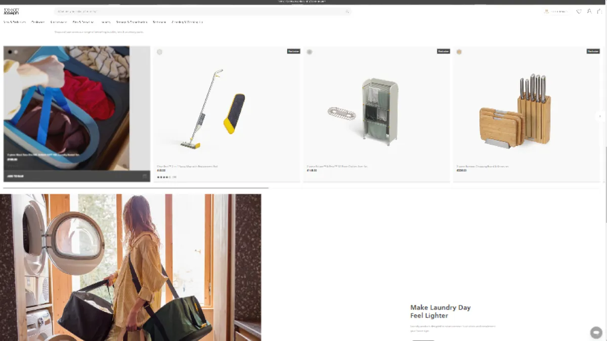
The dynamic header aimed to combine the best of both options: the extra browsing space of a non-sticky header, with the convenience of navigation that comes back when customers want it.
As shoppers browse down the page, the header slides out of the way. The moment they scroll up, it returns, so search and navigation are always one gesture away.
Proof3 built all three experiences with Mida's code editor and ran them as an A/B/n test across the whole site for desktop and tablet visitors, splitting traffic evenly between the control and both variants. The test ran for 19 days, with purchase conversion, add to basket and revenue per user as the key metrics.
After 19 days, Variant 2 (Dynamic), the header that reappears on scroll up, was ahead of the permanently sticky control on every key metric:
Testing three experiences side by side revealed something a simple A/B test would have missed. The fully non-sticky header (Variant 1) freed up just as much space, but performed worse than the control, with add to basket down 15.10% and purchase conversion down 1.86%.
Shoppers clearly still relied on the header. Removing it entirely made navigation harder to reach, while bringing it back on scroll up kept it available at exactly the moment customers looked for it.
Context matters more than visibility. Navigation doesn't need to be on screen all the time, but it does need to appear the moment a shopper wants it. A header that responds to scroll direction gives both browsing space and easy access.
Test more than one alternative. Running an A/B/n test in Mida let Proof3 compare a "remove it" and a "make it smarter" approach in one experiment, showing not just that the sticky header could be improved, but which direction worked.
If you're looking to optimize your website's performance and streamline your A/B testing process, Mida is the ideal solution.
With its lightweight script and focus on performance, Mida ensures that your website remains fast and responsive while offering powerful A/B testing capabilities. Experience the benefits of Mida by integrating our lightweight script into your website today.
---
Get started for free on Mida — up to 100,000 monthly tracked users.
Mida is 10X faster than anything you have ever considered. Try it yourself.

Still deciding?
A quick screen share on your actual site — no slides, no generic tour. Just your questions answered.
30 min · no commitment · no sales pressure